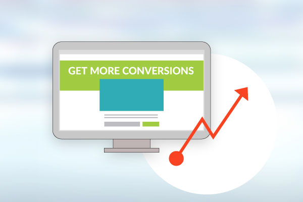
“If you apply what I am going to share, you should see an instant increase in conversions.”
So, one of the mistakes I see fitness professionals make over and over again is when they focus all of their efforts on Facebook ads while completely ignoring their landing page.
For those of you who don’t know what I mean when I say landing page, I’m referring to the page you send your Facebook traffic to. This is the page that has your offer on it. It could be an opt-in to build your list or a low barrier offer. Check out our Free Funnel landing page to get a better idea.
Make sense? Cool.
Now relax! I know what you’re thinking, “Hey, this is supposed to be an article on landing pages and how to get them to convert better, not an article on Facebook ads!” It is, stay with me.
You see, most of the time when people come to us they think they have a Facebook ads issue, and sometimes that is the problem. But, most of the time it’s not.
Actually, what I have found is that the biggest issue and real reason most are getting terrible results is because their landing page looks like a 3 year old designed it!
I’m not here to offend anyone. And, I give all the credit in the world to people who try to create their own landing pages and offers, but some are downright terrible.
I mean, I look at some of the pages people send me and ask myself, “And they think the problem is their ad?” Some have no address, no phone number, and, even worse, no clear offer.
Okay, forget that. Some don’t even have good before and after photos or any testimonials at all! Look, if you’re a fitness pro, testimonials are the lifeline of your marketing. Social Proof is key when marketing your fitness business.
TIP: If you haven’t read the book “Influence,” by Robert B. Cialdini, I suggest you get it ASAP! It’s a must read in my opinion. One of the key points in the book is the importance of social proof.
Okay, back to the agenda at hand.
The reason I wrote this article is to share with you some key strategies that your landing pages must have. Well, some are tests, or items that I suggest you have so that you get the most out of your landing pages.
If you apply what I am going to share, you should see an instant increase in conversions.
Let’s get to them.
#1. The 3 Second Rule: This one should really be called the split second rule because that is how fast we make decisions when deciding whether something looks professional or not.
Your landing pages should clearly display:
- Your company name
- What you are offering
- Why should they be interested
- How they can get it
Someone should never be confused as to what the offer is and what the point of the page is.
TIP: You want to know what the number 1 killer of conversions is? It’s confusion. If your prospects are confused and don’t know what you’re offering, you can kiss that person goodbye. They’ll be gone faster than a piece of cake on cheat day!
#2. Your Contact info: You want your phone number, email address, and physical address easily visible on your pages, especially, if you’re a local business. We get a ton of leads for our clients by simply adding this information. If you have a local business and you don’t have your contact info on your pages, get it on there now.
Leads come in many forms, not just emails or sales. When people have questions, they want to able to ask them and they don’t want to dig for your contact info. Not to mention the fact that is gives your business instant credibility.
#3. You, You and You: Change the copy on your pages from “we” to “you.” Often times, when I’m reading a landing page, I see: “And, we offer this…”, “We do that”, and “we, we, we”. Who gives a shit what “we” do? Change the message to “you.” Here’s an example: “Imagine how you will feel when your friends come up to you and say ‘WOW, you look amazing!’”
Get the point? Good. Moving along.
#4. Testimonials. Make sure your pages have before and after pictures. If you’re in the fitness business and don’t have these, get some! I don’t care if you are new and have just one happy client. Ask them. If you don’t have pictures, get a video of one your clients giving you a testimonial. The more you have, the better.
Then, make sure you have them on your landing pages!
We are in the fitness business after all aren’t we? Let me tell you a quick story. The other day, a personal trainer asked me to review his website for him. He had 15-20 written testimonials from clients and NOT one single picture! Who has time to read a bunch of text?
TIP: Use testimonials near high anxiety spots, like order buttons or on the order form itself.
#5. Use contrasting Colors: Your call-to-action buttons, such as, “click here to order” or “enter your email address here,” should be in contrasting colors. You don’t want them to blend in with the rest of the page. The best colors to use are red and orange. Stay away from using the color blue.
Use these strategies and tips on your pages and you will see a nice bump in conversions. I’ve already mentioned it, but this piece of advice is worth repeating: Make sure you have a clear offer. That is the single most important thing. I don’t care how good or bad your page looks, if the offer isn’t clear, or the visitor needs to figure out what it is, you’ll lose them.
If you would like me to look at your landing page and help you make it better, please feel free to email me at carlo@fitnessmarketer.com or Schedule a Strategy Call. I’d be happy to look it over for you.
I wish you all the best.
-Carlo Bernoni
Don’t have time to waste and need leads by tomorrow? We have AWESOME done-for–you pages ready to go! Let me know if you would like to see some examples.

